Introduction
Welcome to my data science projects portfolio.
- Author: Jennifer Yoon
- Contact email: "datasciY.info@gmail.com"
- Resume: data science resume PDF
- GitHub Profile: JennEYoon
- Stack Overflow Profile: user:4693491, user name: Jennifer Yoon
This projects portfolio is very much a work in progress. When the portfolio is full, my goal is to cover the full spectrum of data science process while using Python, SQL, Excel-VBA, Amazon Web Services (AWS) and Google Colaboratory (Colab).
My main area of interest is in applying data science tools to bring value to the financial derivative securities industry, the financial risk management industry, and the economic policy and financial regulation industries. I am also interested in visual deep learning as it is applied to brain segmentation image analysis (e.g., Janelia.org), to geospatial intelligence analysis (e.g., NGA.mil), and to geospatial image analysis for climate change (e.g., Planet Labs).
Some of the specific types of analyses I will be performing include: decision trees and random forests, principal component analysis (PCA), k-means clustering, sentiment analysis, natural language processing (NLP), linear regression, logistic regression, time-series, econometrics, big data cloud computing, deep-learning and convolutional neural networks (CNN), and image recognition.
Amazon Rainforest Project
- Date: July 20, 2021
- Link: Amazon Rainforest Project wiki
- Link: github code repo
- Link: Amazon rainforest project-page, to add
- Link: Planet Labs, images gallery
- Tags: Amazon rainforest, satellite image, geospatial image, deep learning, image classification, prediction model, time-series, climate change, deforestation, Brazil, Amazonia
I am working on a deep learning project to study the Amazon rainforest using satellite images from Planet Labs. Semi-annual high resolution data is provided free during 2019 to 2022 period due to a special funding. This will be an end-to-end deep learning project. I have two collaborators (Dan and Peter) who are providing me with feedback. I started a wiki on GitHub, see link above. I decided to document this project as I go. I am feeling the need to organize my work as this project gets large and unwieldy. I also think it will be too much work to document it all at once if I left it to the end. =.P
Using NumPy Data Arrays
Practice exercises using NumPy n-dimensional arrays.
- Numpy Exercise 1 (html), GitHub
- NumPy Exercise 2 (py), GitHub
Aside:
Python standard library includes an Array module that can seem similar to Numpy at first glance. However, the Array module creates list-like structures that cannot be used to do matrix multiplication or use the "@" at-symbol for element by element multiplication or addition. Numpy also has a structured data array ability similar to Pandas or Xarray libraries. I think it may be a vestigial feature from years ago when Pandas and Xarray did not exist or was not as well developed. However, I think the structured array part of Numpy is still useful today. I can see this being a handy tool for memory-limited operations, for example in a mobile phone app. Pandas is a large library to load. Xarray is designed to be the solution for large, parallel datasets. It's supposed to be the solution for the slow processing speed of Pandas. Xarray works on top of Numpy's n-dimensional arrays, which in turn is written in C for faster computation.
Array — Efficient arrays of numeric values
"This module defines an object type which can compactly represent an array of basic values: characters, integers, floating point numbers. Arrays are sequence types and behave very much like lists, except that the type of objects stored in them is constrained."
(See: https://docs.python.org/3/library/array.html)
Matplotlib "ax" and "plt" Methods
I am working on a demo of Matplotlib commands that clearly separates out the "ax" (object oriented) method from the "plt" (Matlab style) method. I found this area to be confusing when I was learning it, so perhaps other students can benefit from following my trail.
Demo to follow.
Visualizing Interactive Charts with Dash and Plotly
Dash is an interactive charting app for the web that can be built using Python. No JavaScript required. Dash is built on top of the Plotly chart definitions. Python developers can use many of Plotly's chart styles in their default mode to create beautiful, interactive charts. Website visitors can zoom in or out of the chart, seeing details or a summary view. Full customization is available via Plotly's open-source GitHub repo.
Dash allows you to build a web app with your customized sliders, radio buttons, text input, and user-selected data sorting and filtering. While Plotly has built-in default chart types with zoom, pan, expand/collapse and data filtering already included.
More to follow.
Titanic Project (ML) DRAFT
Passenger information from the Titanic ship is a common data set used in machine learning (ML). Here I use Python and data science libraries to find patterns in the data and build a prediction model. Then I use various visualization libraries to create pretty figures.
- View html version of Jupyter notebook: Titanic-NB-HTML
- Download from GitHub, full Jupyter notebook: GitHub Titanic-NB
- Tags: exploratory data analysis (EDA), machine learning (ML), graphics, logistic regression
- Data: https://www.kaggle.com/c/titanic/data: Kaggle Titanic data.
- Reference: Rossant, Cyrille, Ipython Interactive Computing and Visualization Cookbook, 2nd ed., Packt Publishing 2018, pp. 299-304.
To be continued later.
Bias-Variance Tradeoff at a Glance
A picture showing conceptually the bias-variance tradeoff in machine learning.
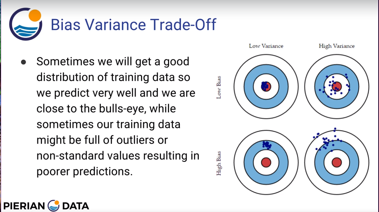
A test result with a bias problem refers to a case where the true mean was totally missed by the machine learning model. See bottom-left target in image above. A test result with a variance problem refers to a case where the machine learning predictions are too widely distributed to provide a meaningful indicator to the decision maker. See top-right target. In most modeling situations, there is a tradeoff between hitting the true mean and reducing the variability around that true mean. Generally, it is not possible to maximize both. See top-left target. But it is possible to achieve poor results in both parameters from a poor model parameter selection. See bottom-right target.
Source: Pierian Data, Udemy.com., Python Machine Learning Data Science Boot Camp
- Udemy class link
- Image from section 16 link. Login to access.
Python Basics and Programming Tools
File-IO Demo
A demonstration of reading in a text file using 'rt' read text and 'rb' read binary methods. For reverse order read and non-sequential read, 'rb' binary read is usually faster. Relative address seek (from end of file and from current position) is only available for binary read method.
- Static view in browser: via nbviewer
- Executable notebook: open in colab.
- View on Github: fileio-demo.ipynb
- Download file from this site: fileio-demo, text file 1, text file 2
Later, I will cover reading from JSON, CSV, Excel, and SQL formats. I will also cover scraping data directly from websites.
Downloading Whole Class, Coursera.org
- Date: September 16, 2020
- Coursera whole class download instruction: markdown file, browser-view jpg
- folder-view jupyter image - to add
- local linux terminal image - to add
While studying Andrew Ng's Deep Learning AI classes on Coursera.org, I needed a way to download the entire class at once, with all of the supporting images and data files. Using the GUI to download files, I had to click and download each file one by one. Some of the Jupyter notebooks have many supporting image files. Large datasets can't be downloaded at all due to download size limit on the server. Maybe Coursera will offer an easier download solution in the future. But for now, "tar" and "cat" Linux commands work on Coursera's Linux server and on my computer's Linux terminal. (I use Windows Subsystem for Linux.) It's important that "tar" and "cat" are default tools built into Linux, since I don't have the permission to install any new tools on Coursera's server. This method may work for non-Coursera classes as well, where you have access to a server-side Linux terminal or a Jupyter notebook with ! Linux shell command capability.
Adding Colab Badge to a Jupyter Notebook
- Date: September 5, 2020
- Jupyter notebook: example_rt.ipynb from Github
- Browser static view: example_rt.ipynb via nbviewer
This is an example of a Jupyter notebook with "Open in Colab" and "Run in Colab" badges. Google Colab is a free machine learning resource using the Jupyter notebook interface. You can run deep learning models on GPU machines and lighter machine learning models on CPU machines. The badges open my example notebook stored on Github.com. You can see the badge code by changing the cell format containing the badge to "raw". Feel free to copy it into your own notebooks. Change the href link to point to your own Github account and file path.
Example notebook shows Matplotlib plotting functions. The first figure is an example of 3-dimensional projection of sign and cosign waves. The second figure is a histogram with three overlapping data series combined into one image. Alpha transparency is set to moderate opacity.